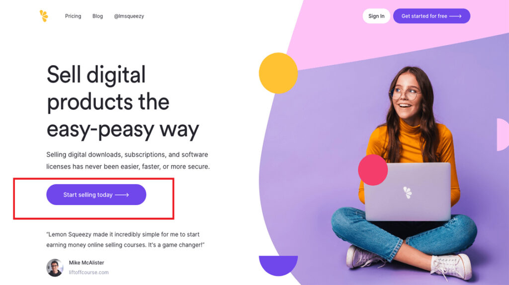
A landing page is a standalone web page created for a specific marketing or advertising campaign with the goal of capturing leads or driving conversions. Landing page design focuses on creating a visually appealing and persuasive page that encourages visitors to take a specific action, such as filling out a form, making a purchase, or signing up for a newsletter.
Here are some key elements and best practices for landing page design:
- Clear and Concise Messaging: The messaging on a landing page should be clear, concise, and focused on the campaign’s goal. Use a compelling headline that grabs attention and communicates the value proposition. Clearly state the benefits or offers that visitors will receive by taking the desired action.
- Strong Call-to-Action (CTA): Every landing page should have a prominent and compelling call-to-action that stands out. The CTA button or link should use action-oriented language and clearly communicate what action visitors should take. Make it visually distinct by using contrasting colors, larger size, or other design techniques to draw attention.
- Minimalist Design: Keep the design clean and uncluttered to avoid overwhelming visitors. Use white space effectively to provide visual breathing room and enhance readability. Use a consistent color scheme that aligns with your branding and highlights important elements.
- Engaging Visuals: Incorporate visually appealing images or videos that are relevant to the campaign and resonate with the target audience. Visuals should help convey the message and evoke emotions that support the desired action.
- Responsive Design: Ensure the landing page is mobile-friendly and responsive, meaning it adapts well to different screen sizes and devices. With the increasing use of mobile devices, it’s crucial to provide a seamless experience across platforms.
- Persuasive Copy: Craft persuasive and compelling copy that supports the messaging and encourages visitors to take action. Use bullet points, subheadings, and short paragraphs to make the content scannable and easy to read. Highlight key benefits and features to capture attention.
- Trust Indicators: Build trust and credibility by incorporating trust indicators, such as testimonials, reviews, certifications, security badges, or client logos. These elements help reassure visitors and increase their confidence in taking the desired action.
- Form Optimization: If your landing page includes a form, keep it simple and ask for only essential information. Long forms can be intimidating and deter conversions. Use clear labels and error messages to guide users through the form submission process.
- A/B Testing: Continuously optimize your landing page by conducting A/B tests. Test different variations of headlines, CTAs, visuals, form layouts, or other elements to identify what resonates best with your audience and drives higher conversion rates.
Remember, the design of a landing page should be aligned with the campaign’s objectives and target audience. Regularly analyze the performance metrics, such as conversion rates and bounce rates, and make iterative improvements based on the data collected to optimize your landing page’s effectiveness.